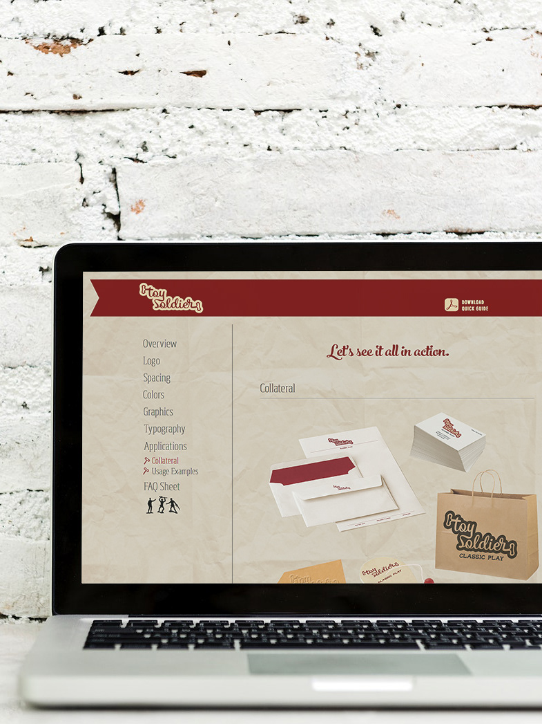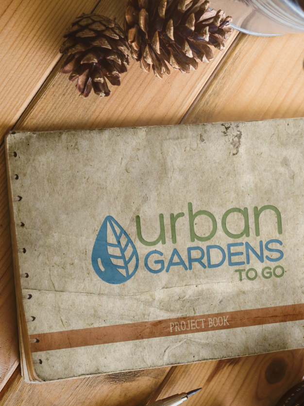
In addition to the Vision Book and Project Book (please see those project uploads), below are the rest of the elements to round out the full campaign. Careful consideration was taken to make sure all parts relate to the overall brand vision. Characteristics of non-traditional, urban, clean, organic and earth-friendly resonate throughout. The company tone is portrayed as unique, distinctive, and recognizable by giving customers the feeling of warm sunshine, garden-fresh smells and pure organic energy all just by walking through the front door.
Animated Logo
Infographic
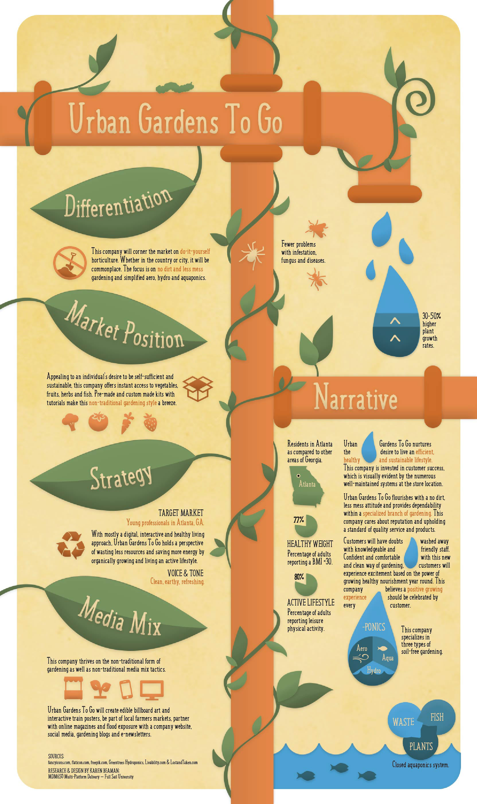
The look and feel of Urban Gardens To Go’s campaign revolves around nature elements with flowing, interlocking and organic shapes and lines. Tubes and piping are used to mimic the hydroponic style of gardening. A sense of growth, harmony, health, cleanliness and water has been reflected with the color choices of green and blue. Usage of orange reflects an energetic attitude and healthy food. Beige/tan has been incorporated for a neutral balance providing a dependable and calming feel. Brown has been intentionally left out due to its connection with soil and dirt. In consideration of the company’s desire to be eco-friendly and digital, a vertical design has been utilized for easier web viewing and mobile adaptation.
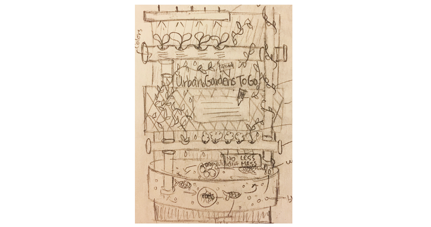
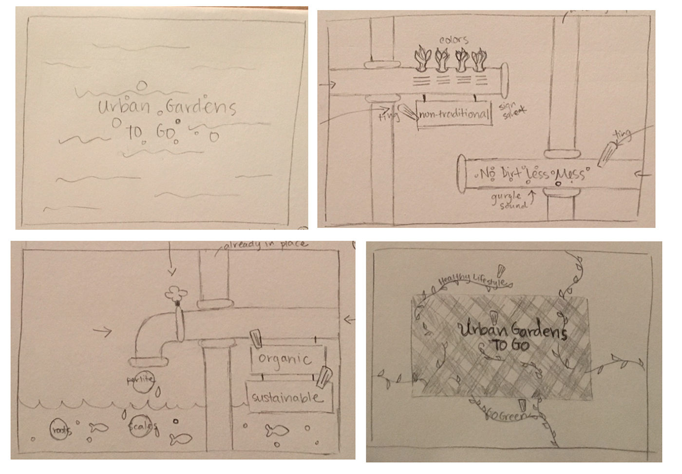
Infographic sketch

Every related element was considered and layout was carefully designed to represent hydroponic piping with easy eye flow. Spacing, placement, and additional elements (vines, leaves, water drops, fish, and graphics) were included for a fully immersive experience.
Mood Board

Urban Garden To Go’s mood board is organic, earthy, energetic and non-traditional. The directional flow clearly communicates the concepts and circles around to cover each unique part. Careful thought went into the eye following vines and water drops. The usage of latticework, perlite (plant growth media), roots, water and scales for texture and pattern; open up a variety of options for later design application. Bubbles, fish, water droplets, leaves, vines, pipes and plant tags will come in handy for shape consistency and relation to aqua, aero and hydroponics. Condensed fonts were selected for the header and subhead to give a funky, fresh and urban feel. San-serif body copy was chosen to denote simplicity and cleanliness (which are differentiating factors for this company). Lastly, a cursive font was added for special subhead use only.
Mood board sketch
Instead of building a blocky and expected mood board, I decided to tell a story. Incorporating all of the similar elements that were used for the infographic, this mood board has movement and flow with several mini events going on. Making it interesting not only gives off a certain energy but uniquely displays all required mood board pieces.
Dynamic Mood Board
Dynamic mood board storyboards
The storyboards were designed with specific nature elements in mind. Balance between water and growing plants is evident by seeing that these concepts are alternated evenly between scenes. The overall pacing is relatively slow to denote a more relaxing and thoughtful attitude. However, quick movements within and transitions have been added to spark attention and accentuate the idea of growth, bubbles and water flow. Mixing between these two speeds guides the viewers in their emotional response to the scene.
Elevator Pitch