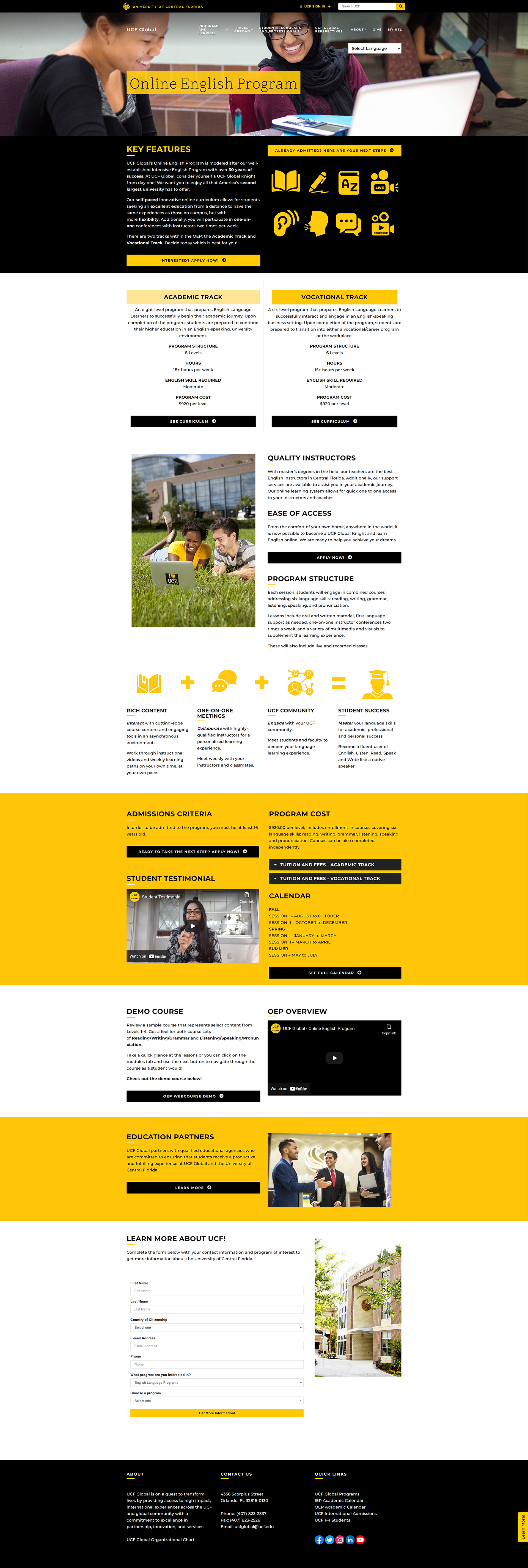
Collaborative effort between marketing and IT, we worked together to redesign and rebuild the website from scratch in a new platform. Navigation with additional sub-navigation menus is easier, search between programs, find events and announcements, and a translate feature was added as well. We have made the student experience as seamless and accessible as possible with a focus on responsive design to support mobile devices.
Programs are easily accessible from the top menu or by scrolling down the main page. Upon rollover the blocks will colorize.
Browse the website and look at the pages for Current Students, Prospective and New Students, Travel Registration, Programs, and much more!
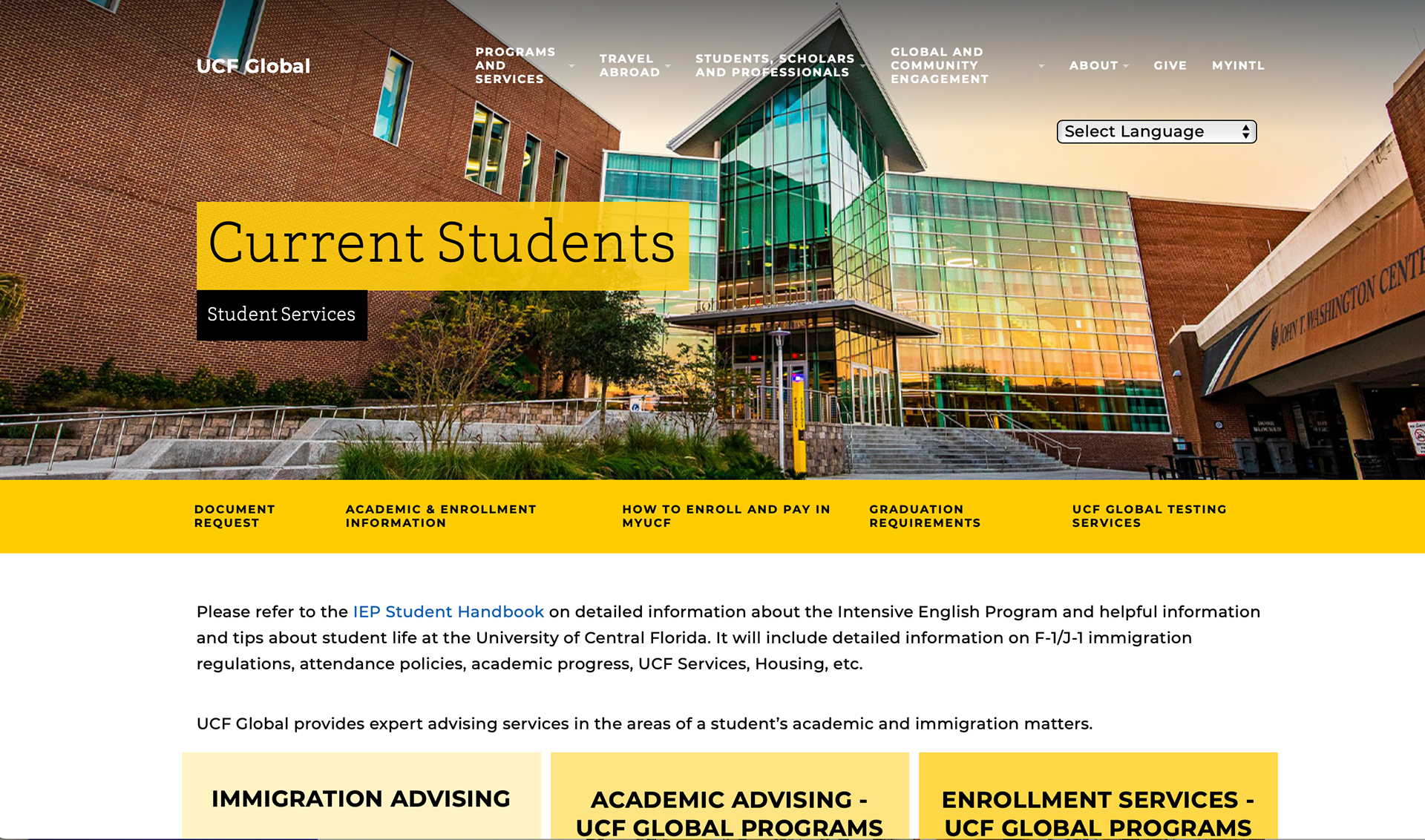
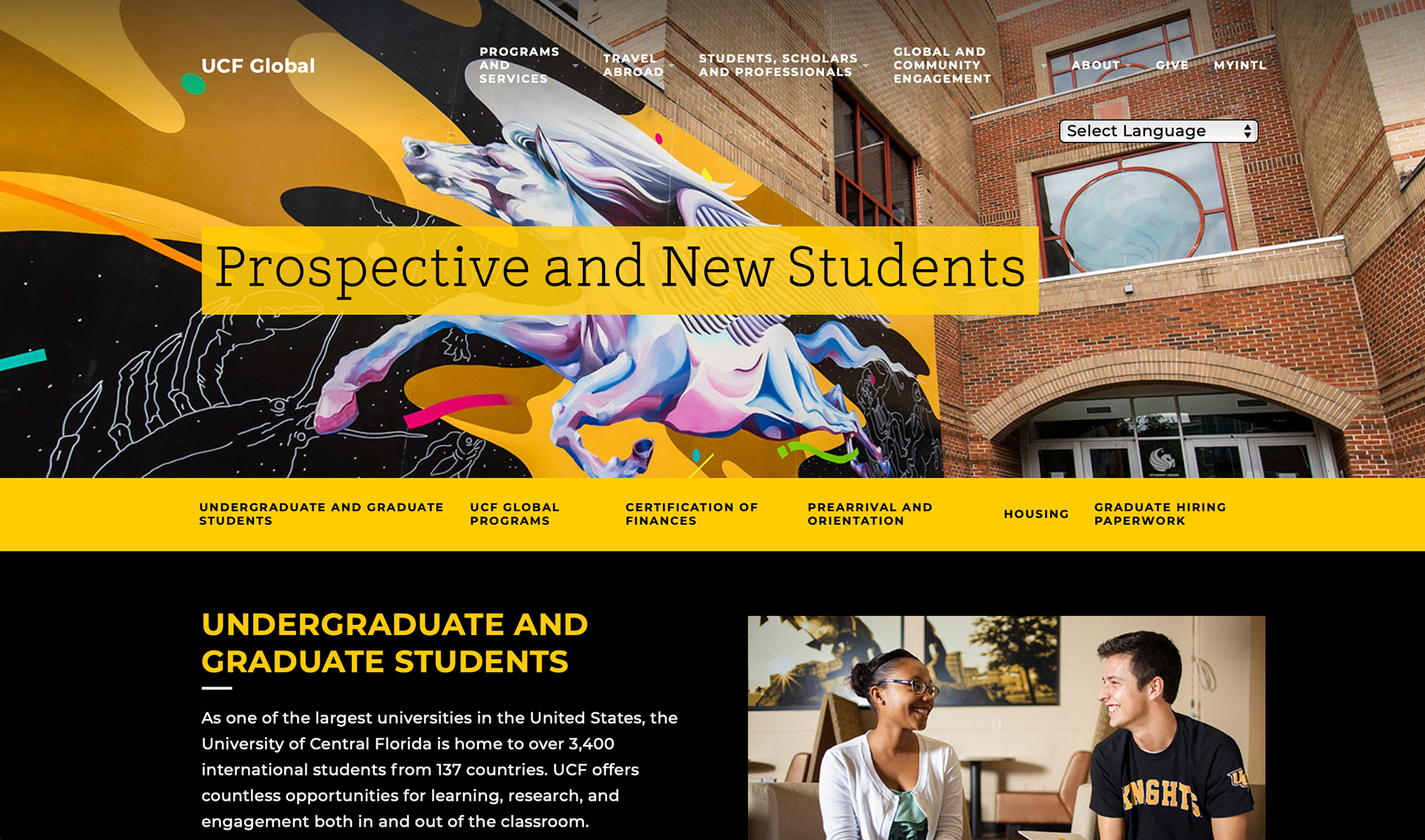
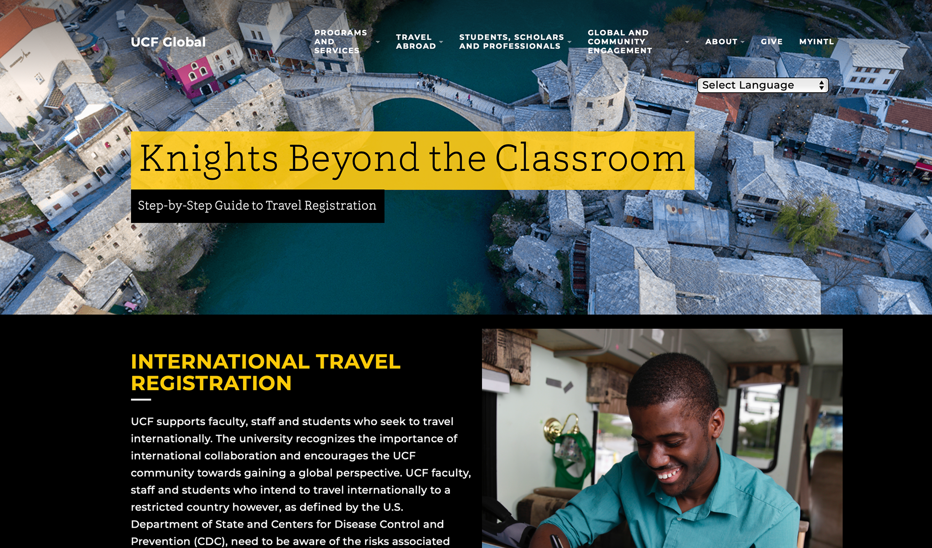
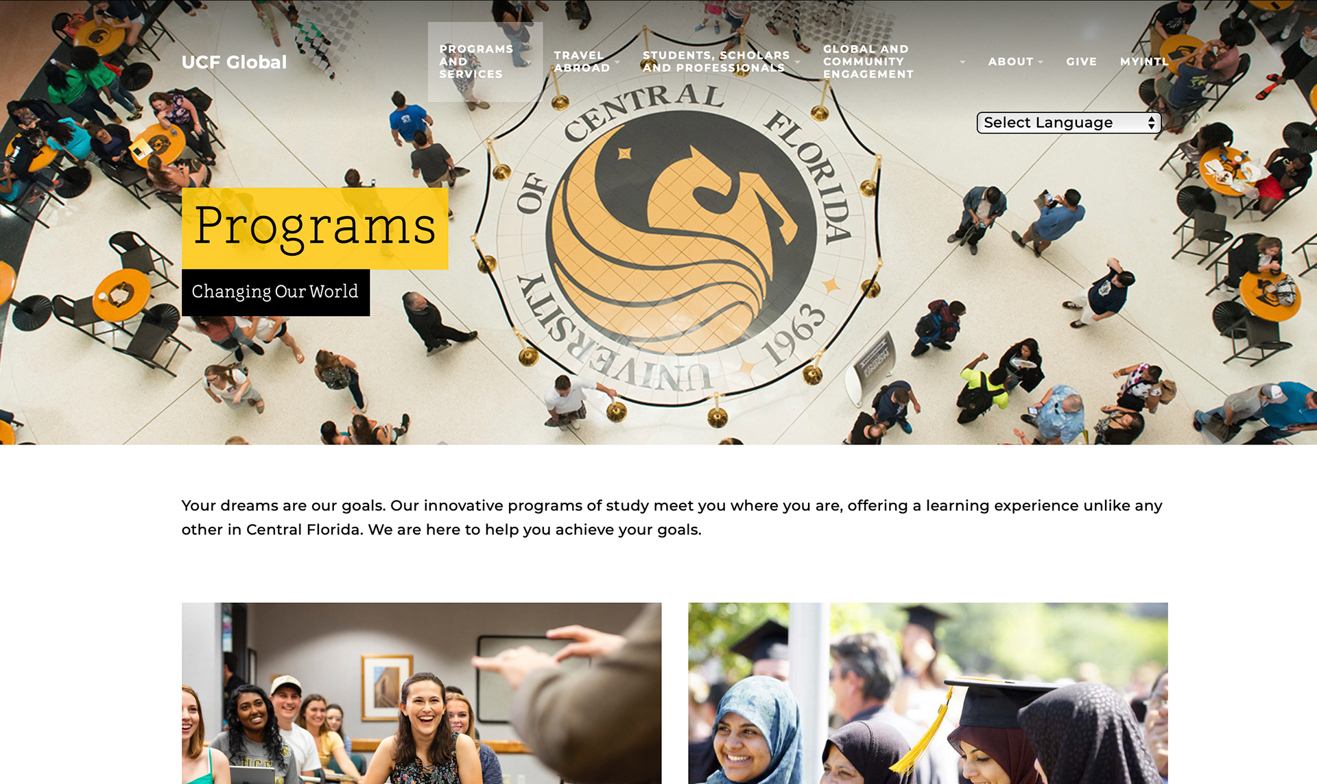
Take a look at several pages side by side before and after the redesign, below.
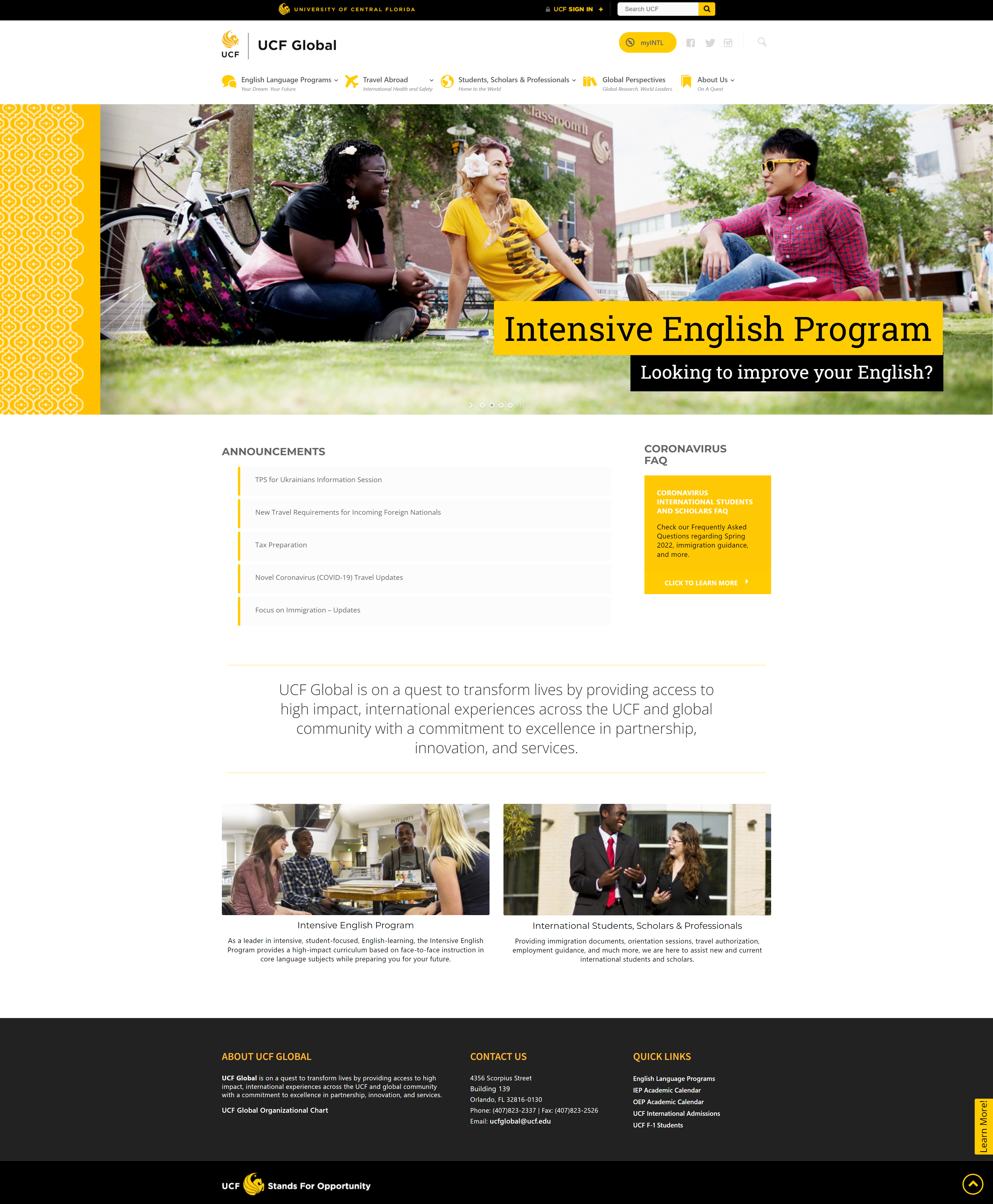
Original - Front Page (Carousel header)
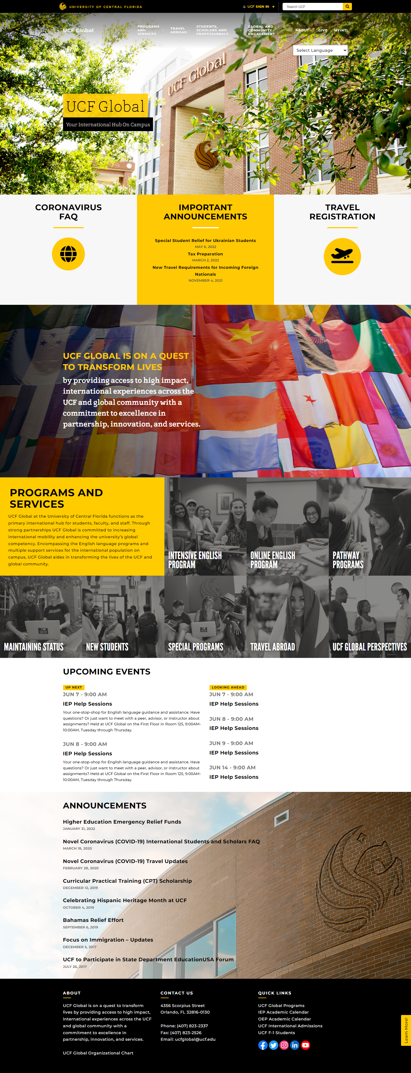
New - Front Page
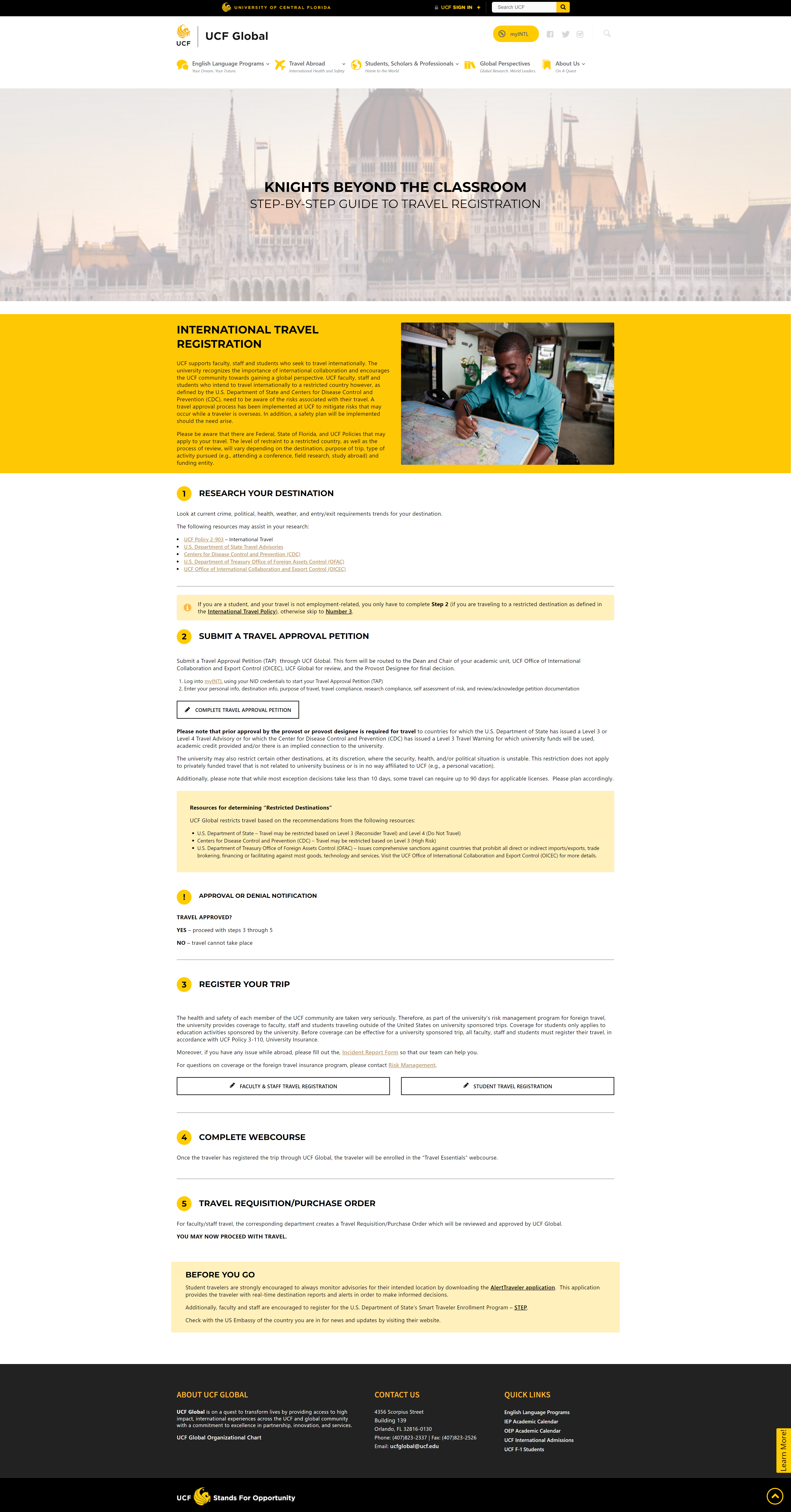
Original - Travel Registration
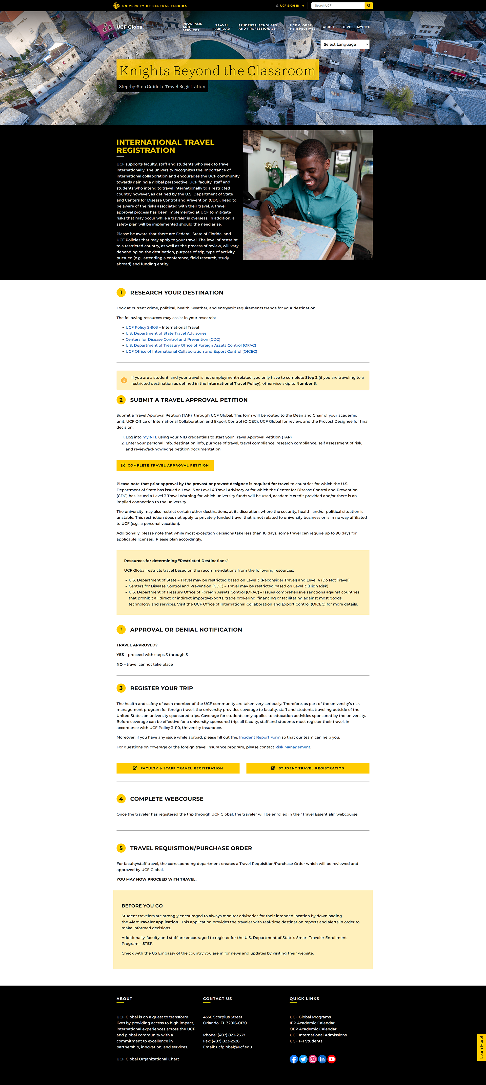
New - Travel Registration
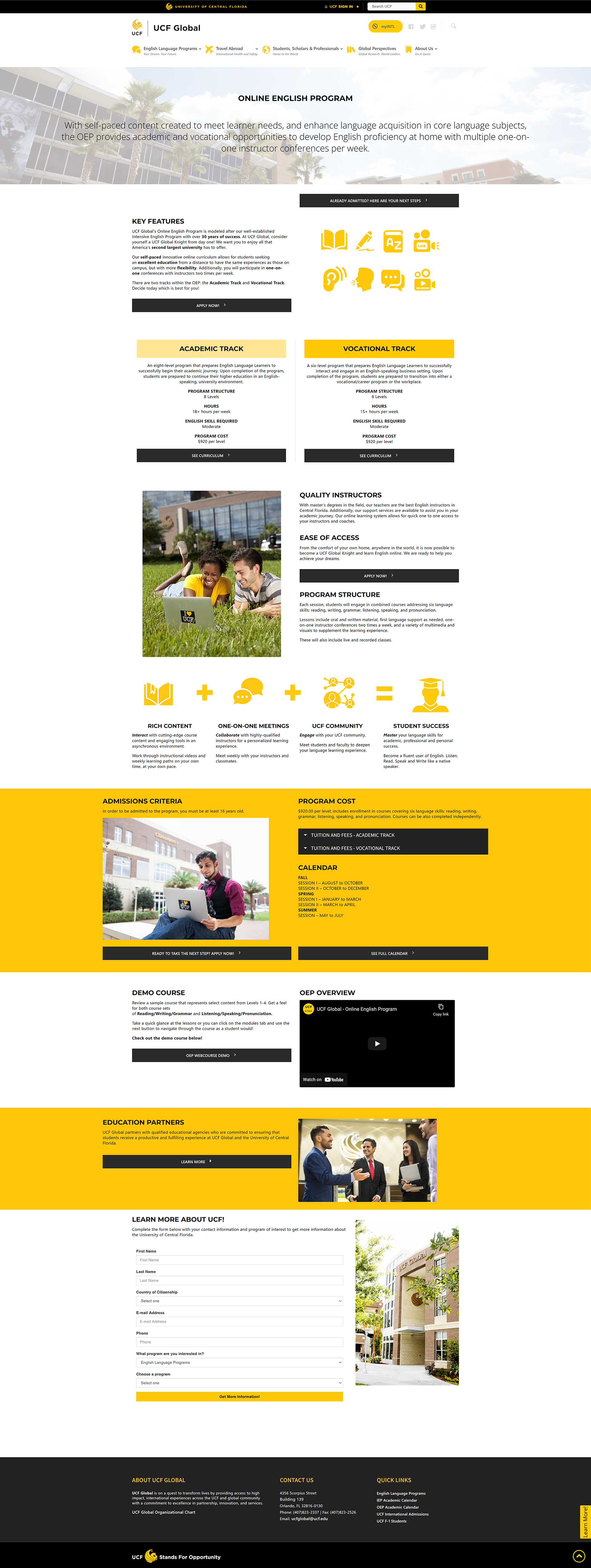
Original - Online English Program
